

Flaticon with Rankerfox
Use Flaticon in the Rankerfox Premium plan to find consistent icons, pictograms, and visual resources, clarify interfaces, and create cleaner support material.

Plan
Flaticon complements the creative branch with Freepik, IconScout, Canva Pro, and Adobe Stock.
Use
Icons should help understanding: navigation, lists, tables, decks, pages, and dashboards.
Check
Before publishing, review visual consistency, size, weight, attribution, and usage rights.
Flaticon makes interfaces and support material easier to read
A good icon is not random decoration. It helps people recognize an action, category, or status before reading the text. Flaticon is useful for keeping a consistent style across pages, dashboards, presentations, thumbnails, and client material.
Choose one coherent family instead of mixing thin line icons, solid pictograms, 3D, and colors without a reason.
Make buttons, cards, lists, tables, and states easier to scan with simple symbols.
Choose SVG, PNG, EPS, or icon fonts depending on size, editing, performance, and final support.
Review license, possible attribution, client context, rights, and consistency with the other resources in the support.
Public visuals for understanding Flaticon
Uicons families, dashboard examples, and collections show how to move from a broad idea to a consistent icon set for an interface.
Flaticon is mainly useful for finding a clear visual sign quickly: action, category, state, business topic, or content type.
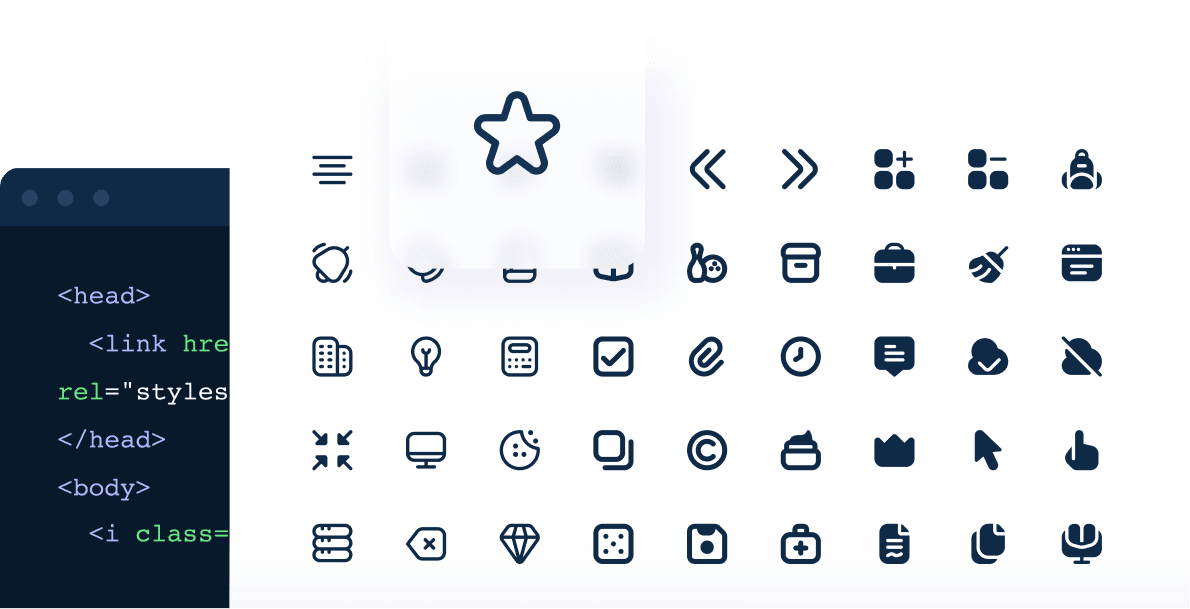
Uicons families help keep pictograms consistent across a page, navigation, or dashboard.
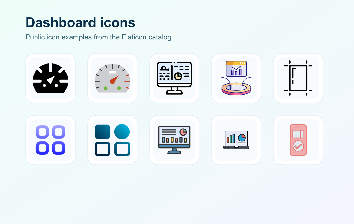
Two icons can say the same thing but not carry the same tone: line, color, roundness, and detail matter.

Collections prevent starting from scratch and make it easier to choose one coherent family for a project.

The icon should be tested in the final support: size, contrast, color, file weight, and mobile readability.
Use Flaticon in a Rankerfox creative flow
Flaticon works best when you start from the final support rather than a visual impulse.
Button, table, deck, page, thumbnail, or onboarding: the icon role should be clear before searching.
Keep style consistent: line, solid, 3D, color, size, detail level, and visual radius.
Check real rendering, contrast, file weight, attribution, and rights before publishing.
Choose icons that truly help the interface
A successful icon reduces the effort needed to understand the page. If it only adds visual noise, it can make the interface heavier without helping users.
Reserve icons for actions and categories people can recognize quickly: search, download, filter, support, validation, alert, or status.
Mixing too many styles quickly makes an interface look amateur. Keep one family, stroke weight, and color logic consistent.
An icon that looks good large can become unreadable inside a button or mobile card. Test it at the exact size of the final support.
Read next for creative assets
Choose the right visuals, icons, and graphic resources for the project you need to produce.
Find images, vectors, PSD, and complementary visual resources.
Compare icons, illustrations, 3D, and Lottie animations.
Compose final visuals with the selected resources.
Complete with photos, design files, videos, and stock assets.
Which Rankerfox plan includes Flaticon?
Flaticon is presented as a Premium tool. Premium also includes the tools available from Standard.
The trial helps discover Rankerfox access and first workflows. New advanced tools are presented in Premium.
Standard already covers several SEO and marketing needs. Tools available from Standard remain included in Premium.
Flaticon is presented as a Rankerfox Premium plan tool, alongside the other advanced catalog tools.
Questions about Flaticon with Rankerfox
Useful points before adding it to a creative routine.
Add Flaticon to Premium creative production
Compare Rankerfox plans and use Flaticon to make your support material clearer and more consistent.
View pricing